|
|
LAYOUT DESIGNS FOR WORK JOURNALS
RETURN TO PORTFOLIO
PAGE 1
-
2
-
3
-
4

An example of a work journal page. Can you find anything wrong with the design, or anything you think could be improved - apart from the content of the text box that is?
|
So, you've done the work, it's all lying on the table in front of you. Now all you have to do is present it in a layout that will catch the eye and be a pleasure to read.
Here, we've put together some design ideas for you to consider when compiling your work journal for assessment.
THE COVER:
Make it exciting. This is the first thing an assessor will see of your work. Make it eye-catching - but relevant to the work inside. There is no point in sticking an image of your best painting of Mount Snowdon if your journal contains only still life.
INSIDE:
Start the inside of your journal off with a good image. This sets out your intention to impress the assessors. It's also a good idea to leave your strongest image for the end - to linger in the memory of the viewer.
|
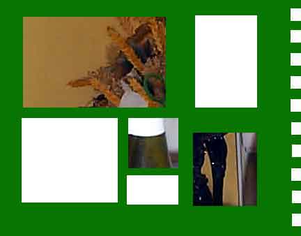
 Another example - balanced but perhaps a bit boring?
( Text doesn't make much sense either!)
|
|
You could experiment with text and design. A balanced design always makes for a pleasant read, but imbalance, if used correctly, and cautiously, can create additional interest.
|
TIP: Cut out pieces of card or paper and try them on a coloured sheet of card in different positions until you are happy with the composition.
|
 A further suggestion for layout
|
|
This page is © Artcymru.co.uk 2002
|
|
|